
ARVO: A typeface that effortlessly jumps out of the page
A story about a typeface’s transformation
This UI project consisted of creating a landing page for a specific typeface — I was designated with Arvo. This was a one week project.
1. Research
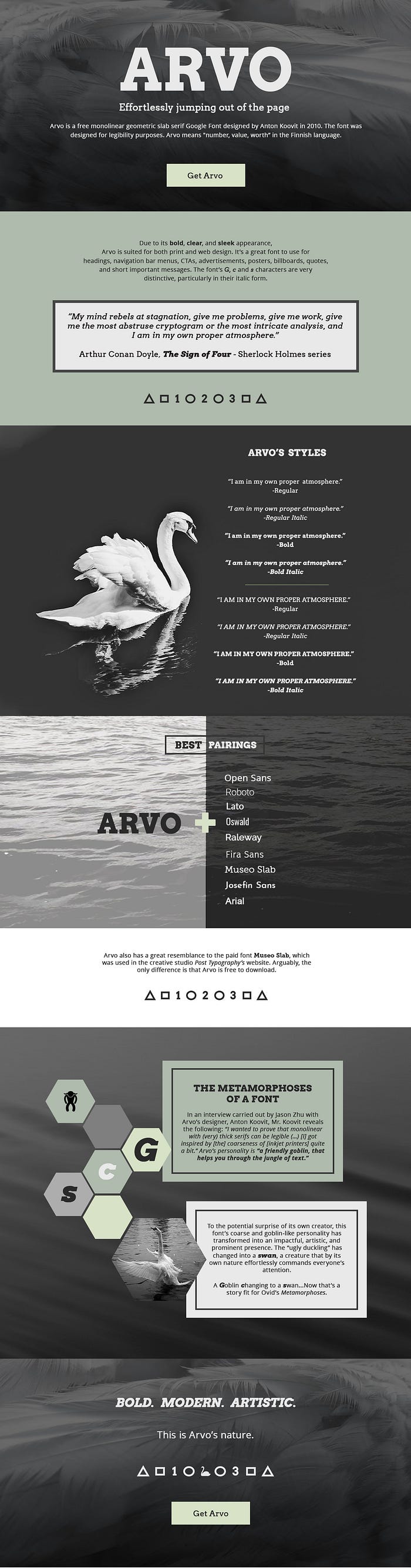
Arvo is a monolinear geometric slab serif designed by Anton Koovit in 2010. It’s a free Google Font and was designed for the purpose of legibility. Arvo means “number, value, worth” in the Finnish language. In contrast to other Google Fonts slab serifs, Arvo contains normal, italic, bold and bold italic styles. The G, c and s characters stand out a lot, especially in their italic style.
There is not much available information about this typeface since it’s a young font. Arvo is part of the slab serif family, thus, an echo of the slab serif fonts used in typewriting machines and the headlines & sub-headlines from 19th-century newspapers.


This resemblance gives Arvo a classical and evocative look to it. Nowadays, the typeface is excellent for both print and web design due to its bold, clear, and sleek appearance. It’s a great font to use for headings, navigation bar menus, CTAs, advertisements, posters, billboards, quotes, and short punchy message

The Designer
In an interview conducted by Jason Zhu with Anton Koovit, while discussing Arvo, Mr. Koovit indicates that he “invested into an inkjet printer and checked how pixels look on paper. [He] got inspired by [the] coarseness of these machines quite a bit.” He further advised that Arvo’s personality is that of “a friendly goblin, that helps you through the jungle of text.”
This piece of information was interesting, especially since the general public commonly uses tags such as modern, classic, bold, striking, uppercase, geometric, etc. to describe this typeface. As these tags and the designer’s concept of view about Arvo were quite different, I decided I needed to know more about the public’s perception of Arvo.
However, I kept Mr. Koovit’s words in the back of my mind throughout the whole process.
Qualitative Research
I proceeded to conduct several short interviews with people from different professional backgrounds and ages. I asked my interviewees several questions about their perception of the font. Some of the questions I asked were:
· How would you describe this font?
· How does it make you feel when you look at it?
· In what places would you expect to see this font?
· What colors come to mind when looking at it?
· If this font would be a person, what would this person’s attributes be?
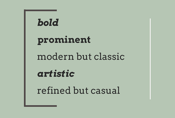
My qualitative research confirmed the veracity of the tags, plus it provided new information. Interviewees repeatedly mentioned the following words: bold, prominent, slightly refined but casual, old fashioned vibe but not truly vintage; strong, easy to read, eye-catchy and artsy.
They also associated the colors black and white with the font. Due to the slab shape and sharp edges, Arvo was identified as a “male”. This person would be someone assertive who holds true to his opinion and has an artistic sense.
The majority of interviewees indicated they would expect to see the font in headers, posters, and short strong messages.
Another interesting detail interviewees advised is that Arvo seemed to have mixed influences. The typeface resembled typewriter documents and old British newspapers. However, its symbols and numbers were more rounded and casual, and the uppercase “J” glyph looked like a stroke used in Kanji. People liked these mixed influences saying they added to Arvo’s uniqueness.
Font in Action
Arvo is used in the navigation bar of the popular artistic posters website Olly Moss. The typeface was also used in the 2016 Berlin state election campaign poster at Karl-Marx-Allee boulevard.


Arvo also has a great resemblance to the paid font Museo Slab, which was used in the creative studio Post Typography’s website. Arguably, the only difference is that Arvo is free to download.
Some of the people who I interviewed were designers. They communicated that Arvo is great for design, as it’s a legible and prominent font. They advised the font is generally too strong to use for extensive body copy, however, they found it perfect for titles, quotations, and short sentences.
2. Design Inception
Font personified
Since I had a significant amount of qualitative data, I decided that the first step would be to personify Arvo according to the public’s perception.

Arvo took the form of a young male adult who looks wise beyond his years, with a slight Steve Jobs-vibe that blends a subtle artistic and refined aura. Arvo has a calm demeanor but also a very commanding presence in the room. Articulate and sharp, however, he doesn’t over speak nor use brash or ostentatious methods to stand out. Arvo has inner strength and relaxed confidence.
The Why
When translating Arvo’s persona into the world of fonts and design, the typeface’s Why became clear to me: “To deliver a prominent eye-catching message without the need to utilize garish methods.” The typeface is so bold that it does not need strong visuals around it in order to stand out.
The mood’s main words became the following:
The Story
In order to represent the visual language, I felt compelled to harmonize Mr. Koovit’s and the general public’s perception of Arvo. After some careful analysis, I concluded that the typeface had transformed into something different than the designer had initially intended it to be -something that happens quite commonly in the art realm. To the potential surprise of its own creator, Arvo’s coarse and goblin-like personality had transformed into an impactful, artistic, and prominent presence.
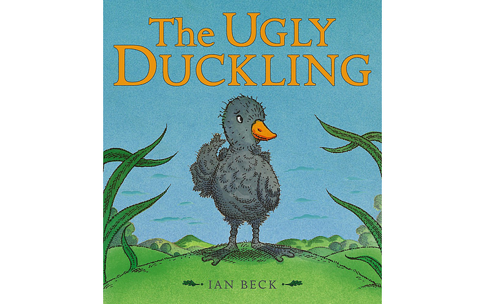
This statement reminded me of the “Ugly Duckling” story, who had also been unsightly but later transformed into a captivating swan.
It was quite curious, as people’s description of Arvo also seemed to be more on par with a swan’s attributes: a creature that by its own nature effortlessly commanded everyone’s attention. It’s very easy to discern the presence of a swan, as their pure white bodies contrast with their usually darker backgrounds. It looks confident, has an artistic nature to it, and resembles the number “2” –as aforementioned, one of Arvo’s meanings is “number.”
Arvo’s story is a modern retelling of the “Ugly Duckling.” It’s the story of the goblin who became a swan.
Visual Language
In order to convey this transformation story and Arvo’s mood, I used the following visual elements:
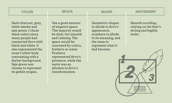
Using all of these components, I proceeded to create my Moodboard.
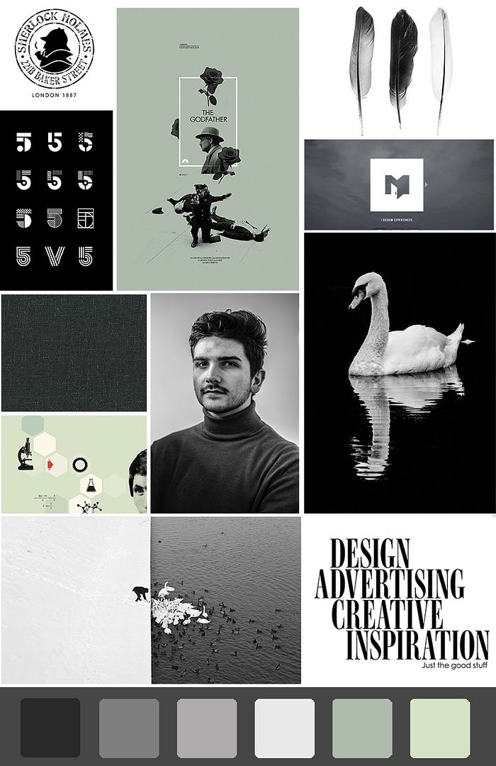
The pictures that really inspired me for my landing page design were:
1) “The Godfather” poster, as it is very elegant and uses negative space in an effective way. Moreover, “The Godfather” also recounts a story about transformation –that of Michael Corleone, from war hero and student to a major crime boss.
2) The hexagons were arranged in an effective way, seeming to communicate a story with the icons within them. It looked like a visual of the man’s train of thought.
3) The bottom picture of the man feeding the swans provided a great and tasteful contrast of dark and white.
Once the moodboard was done I later proceeded to sketch the wireframes for my landing page and moved onto Photoshop.
3. The final product
This is the finished landing page for the Arvo typeface. It conveys Arvo’s nature as per what is described in the Design Conception chart and recounts the metamorphoses story in a visual way.
Conclusion
Arvo’s goal is to deliver a prominent eye-catching message without the need to utilize flashy methods. It’s a fascinating typeface that presents us with a story about transformation. So next time you’re looking to use in your designs a typeface that is prominent by nature, think about Arvo, and give it the opportunity to also transform your designs into something remarkable.
*****
Resources used for landing page:
- Swan photographs taken by Jake Dela, Fabio Jock, Miro Polca
- Feathers close up picture taken by Nico Frey
- Arvo’s persona picture taken by Nicolas D.
- Water picture by Marco del Borrello
- Swan icon by Tatiana Belkina
- Feather icon by Saeful Muslim
- Goblin icon by Gan Khoon Lay
